

React Tutorial - Getting started with Material-UI
In this tutorial, we will get started with Material-UI using the Grid, Paper, Typography, Avatar, and withStyles components and even make use of material icons. Let's get started!


Get the sourcecode for this project here
1. Install Material-UI
Create a new project and install material-UI core, icons and the recommended typeface, Roboto.
npm install --save @material-ui/core @material-ui/icons typeface-roboto2. Make It Responsive with Grid
An important part of any web site is its ability to adapt to different screen sizes. The Grid component allows you to do this easily and is the perfect component to start your projects with. To create a grid, wrap multiple Grid items in a Grid container and each item within the container will know to respect the other items position on the screen. Let's start by building a simple 2x2 Grid.
Step 1
Add a class based component to your project.
import React, { Component } from "react";

class MyComponent extends Component {
  render() {
    return <div>{/* insert Grid here */}</div>;
  }
}
export default MyComponent;
Step 2
Import Grid from Material-UI and add a Grid container with 4 Grid items that have the property "xs=6" to get your 2x2 grid.
import React, { Component } from "react";
import Grid from "@material-ui/core/Grid";

class MyComponent extends Component {
  render() {
    return (
      <div>
        <Grid container>
          <Grid item xs={6}>
            {/* insert contents here */}
          </Grid>
          <Grid item xs={6}>
            {/* insert contents here */}
          </Grid>
          <Grid item xs={6}>
            {/* insert contents here */}
          </Grid>
          <Grid item xs={6}>
            {/* insert contents here */}
          </Grid>
        </Grid>
      </div>
    );
  }
}
export default MyComponent;
Step 3
Import withStyles from Material-UI so that we can style our Grids. Add some text inside your Grid items and you have yourself a grid.
import React, { Component } from "react";
import Grid from "@material-ui/core/Grid";
import { withStyles } from "@material-ui/core/styles";
const styles = {
root: {
margin: 20,
},
gridItem: {
backgroundColor: "blue",
color: "white",
borderStyle: "solid",
},
};
class MyComponent extends Component {
render() {
const { classes } = this.props;
return (
<div className={classes.root}>
<Grid container>
<Grid item xs={6} className={classes.gridItem}>
ONE
</Grid>
<Grid item xs={6} className={classes.gridItem}>
TWO
</Grid>
<Grid item xs={6} className={classes.gridItem}>
THREE
</Grid>
<Grid item xs={6} className={classes.gridItem}>
FOUR
</Grid>
</Grid>
</div>
);
}
}
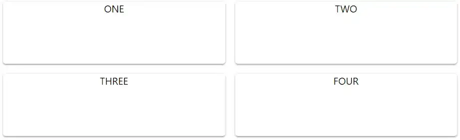
export default withStyles(styles)(MyComponent);Here is what you'll see.

Sure, its a little ugly but you get the idea.
3. Create a Surface with Paper
Google's material design specifications attempt to bring physical textures and surfaces to the digital world. Paper surfaces are one way that Google does this. Let's try to improve our Grid example with Material-UI's implementation of Paper.
Step 1
Continuing from our grid example, import Paper into your component and wrap your Grid item contents in <Paper> tags with a height of 100. Remove the Grid item styling:
import React, { Component } from "react";
import Grid from "@material-ui/core/Grid";
import Paper from "@material-ui/core/Paper";
import { withStyles } from "@material-ui/core/styles";
const styles = {
root: {
margin: 20,
},
paper: {
height: 100,
},
};
class MyComponent extends Component {
render() {
const { classes } = this.props;
return (
<div className={classes.root}>
<Grid container spacing={16}>
<Grid item xs={6}>
<Paper className={classes.paper}>ONE</Paper>
</Grid>
<Grid item xs={6}>
<Paper className={classes.paper}>TWO</Paper>
</Grid>
<Grid item xs={6}>
<Paper className={classes.paper}>THREE</Paper>
</Grid>
<Grid item xs={6}>
<Paper className={classes.paper}>FOUR</Paper>
</Grid>
</Grid>
</div>
);
}
}
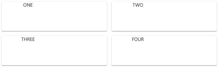
export default withStyles(styles)(MyComponent);As you can see, our Grid items now have a feeling of depth as if they are coming off the page. All thanks to the Paper component.
4. Add some Text with Typography
It is important to have consistent font styles and sizes throughout your application. Material-UI's Typography component helps ensure this happens. Continuing with our example, lets split our 4 Grid items in half and add some text to the right half of each of them using the Typography component.
Step 1
Add a Grid container to your Paper component with two Grid Items of size 6 each. Give them a className of "classes.inner" with margin set to auto that we will need later for styling.
// ...
import Typography from "@material-ui/core/Typography";

// ...

<div className={classes.root}>
  <Grid container spacing={16}>
    <Grid item xs={6}>
      <Paper className={classes.paper}>
        <Grid container>
          <Grid item xs={6} className={classes.inner}>
            ONE
          </Grid>
          <Grid item xs={6} className={classes.inner}>
            <Typography>
              Lorem ipsum dolor sit amet, consectetur adipiscing elit, sed eiusmod tempor incididunt
              ut labore et dolore magna aliqua.
            </Typography>
          </Grid>
        </Grid>
      </Paper>
    </Grid>
    <Grid item xs={6}>
      <Paper className={classes.paper}>
        <Grid container>
          <Grid item xs={6} className={classes.inner}>
            TWO
          </Grid>
          <Grid item xs={6} className={classes.inner}>
            <Typography>
              Lorem ipsum dolor sit amet, consectetur adipiscing elit, sed eiusmod tempor incididunt
              ut labore et dolore magna aliqua.
            </Typography>
          </Grid>
        </Grid>
      </Paper>
    </Grid>
    <Grid item xs={6}>
      <Paper className={classes.paper}>
        <Grid container>
          <Grid item xs={6} className={classes.inner}>
            THREE
          </Grid>
          <Grid item xs={6} className={classes.inner}>
            <Typography>
              Lorem ipsum dolor sit amet, consectetur adipiscing elit, sed eiusmod tempor incididunt
              ut labore et dolore magna aliqua.
            </Typography>
          </Grid>
        </Grid>
      </Paper>
    </Grid>
    <Grid item xs={6}>
      <Paper className={classes.paper}>
        <Grid container>
          <Grid item xs={6} className={classes.inner}>
            FOUR
          </Grid>
          <Grid item xs={6} className={classes.inner}>
            <Typography>
              Lorem ipsum dolor sit amet, consectetur adipiscing elit, sed eiusmod tempor incididunt
              ut labore et dolore magna aliqua.
            </Typography>
          </Grid>
        </Grid>
      </Paper>
    </Grid>
  </Grid>
</div>;
// ...
Grid items split in half.
Step 2
Import the Typography component from Material-UI and add it to the second inner Grid item. Add some text.
// ...
import Typography from "@material-ui/core/Typography";
// ...
<div className={classes.root}>
<Grid container spacing={16}>
<Grid item xs={6}>
<Paper className={classes.paper}>
<Grid container>
<Grid item xs={6} className={classes.inner}>
ONE
</Grid>
<Grid item xs={6} className={classes.inner}>
<Typography>
Lorem ipsum dolor sit amet, consectetur adipiscing elit, sed eiusmod tempor incididunt
ut labore et dolore magna aliqua.
</Typography>
</Grid>
</Grid>
</Paper>
</Grid>
<Grid item xs={6}>
<Paper className={classes.paper}>
<Grid container>
<Grid item xs={6} className={classes.inner}>
TWO
</Grid>
<Grid item xs={6} className={classes.inner}>
<Typography>
Lorem ipsum dolor sit amet, consectetur adipiscing elit, sed eiusmod tempor incididunt
ut labore et dolore magna aliqua.
</Typography>
</Grid>
</Grid>
</Paper>
</Grid>
<Grid item xs={6}>
<Paper className={classes.paper}>
<Grid container>
<Grid item xs={6} className={classes.inner}>
THREE
</Grid>
<Grid item xs={6} className={classes.inner}>
<Typography>
Lorem ipsum dolor sit amet, consectetur adipiscing elit, sed eiusmod tempor incididunt
ut labore et dolore magna aliqua.
</Typography>
</Grid>
</Grid>
</Paper>
</Grid>
<Grid item xs={6}>
<Paper className={classes.paper}>
<Grid container>
<Grid item xs={6} className={classes.inner}>
FOUR
</Grid>
<Grid item xs={6} className={classes.inner}>
<Typography>
Lorem ipsum dolor sit amet, consectetur adipiscing elit, sed eiusmod tempor incididunt
ut labore et dolore magna aliqua.
</Typography>
</Grid>
</Grid>
</Paper>
</Grid>
</Grid>
</div>;
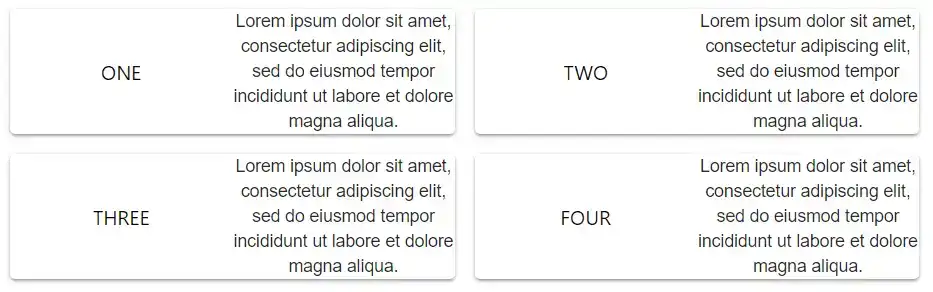
// ...With the Typography component you get consistent, stylish text every time.
5. Use Imagery with Avatars
Avatars are part of Google's material design specification and allow you to make use of uniform imagery throughout your projects. Let's add an Avatar component with an Icon to our example to finish it off.
Step 1
Import the Avatar component from Material-UI. Add Avatar components to the other half of the inner Grid items with className set to "classes.avatar".
// ...
import Typography from "@material-ui/core/Typography";
import Avatar from "@material-ui/core/Avatar";

const styles = {
  root: {
    margin: 20,
  },
  paper: {
    height: 100,
  },
  inner: {
    margin: "auto",
  },
  avatar: {
    backgroundColor: "grey",
    height: 50,
    width: 50,
    margin: "auto",
  },
};

// ...
<div className={classes.root}>
  <Grid container spacing={16}>
    <Grid item xs={6}>
      <Paper className={classes.paper}>
        <Grid container>
          <Grid item xs={6} className={classes.inner}>
            <Avatar className={classes.avatar}>{/* insert icon here */}</Avatar>
          </Grid>
          <Grid item xs={6} className={classes.inner}>
            <Typography>
              Lorem ipsum dolor sit amet, consectetur adipiscing elit, sed eiusmod tempor incididunt
              ut labore et dolore magna aliqua.
            </Typography>
          </Grid>
        </Grid>
      </Paper>
    </Grid>
    <Grid item xs={6}>
      <Paper className={classes.paper}>
        <Grid container>
          <Grid item xs={6} className={classes.inner}>
            <Avatar className={classes.avatar}>{/* insert icon here */}</Avatar>
          </Grid>
          <Grid item xs={6}>
            <Typography>
              Lorem ipsum dolor sit amet, consectetur adipiscing elit, sed eiusmod tempor incididunt
              ut labore et dolore magna aliqua.
            </Typography>
          </Grid>
        </Grid>
      </Paper>
    </Grid>
  </Grid>
</div>;
// ...
and the result:
Step 2
Import the AccountCircle icon from Material-UI and add it within your Avatar components with a className set to "classes.icons".
// ...
import Avatar from "@material-ui/core/Avatar";
import AccountIcon from "@material-ui/icons/AccountCircle";
const styles = {
root: {
margin: 20,
},
paper: {
height: 100,
},
inner: {
margin: "auto",
},
avatar: {
backgroundColor: "grey",
height: 50,
width: 50,
margin: "auto",
},
icon: {
height: 50,
width: 50,
},
};
// ...
<div className={classes.root}>
<Grid container spacing={16}>
<Grid item xs={6}>
<Paper className={classes.paper}>
<Grid container>
<Grid item xs={6} className={classes.inner}>
<Avatar className={classes.avatar}>
<AccountIcon className={classes.icon} />
</Avatar>
</Grid>
<Grid item xs={6} className={classes.inner}>
<Typography>
Lorem ipsum dolor sit amet, consectetur adipiscing elit, sed eiusmod tempor incididunt
ut labore et dolore magna aliqua.
</Typography>
</Grid>
</Grid>
</Paper>
</Grid>
<Grid item xs={6}>
<Paper className={classes.paper}>
<Grid container>
<Grid item xs={6} className={classes.inner}>
<Avatar className={classes.avatar}>
<AccountIcon className={classes.icon} />
</Avatar>
</Grid>
<Grid item xs={6}>
<Typography>
Lorem ipsum dolor sit amet, consectetur adipiscing elit, sed eiusmod tempor incididunt
ut labore et dolore magna aliqua.
</Typography>
</Grid>
</Grid>
</Paper>
</Grid>
</Grid>
</div>;
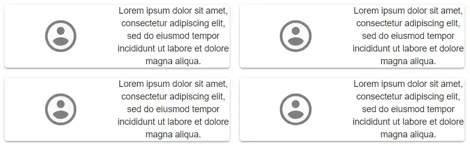
// ...Wrapping images and icons with the Avatar component gives images the same style and feel through out your websites and web apps.
Conclusion
These examples should give you a taste of the power of Material-UI components and how easy it is to make your websites look great and function right. In this tutorial, you have already made use of the Grid, Paper, Typography, Avatar, and withStyles components and even got to try Icons. Have a look at Material-UI's component demo's for even more examples of what you can do with this excellent collection of components.
Tools
Crypto Alerts
© Cloud Giant 2024. All rights reserved